About the project
My friend, Alen, has always had a passion for all things food and cooking related. With a dream to share her cooking with the world, Alen’s Kitchen was born. He aims to promote vegetarian dishes by sharing easy and tasty recipes, sell a variety of products online and in the near future He wants to offer a food delivery service.
The Challenge
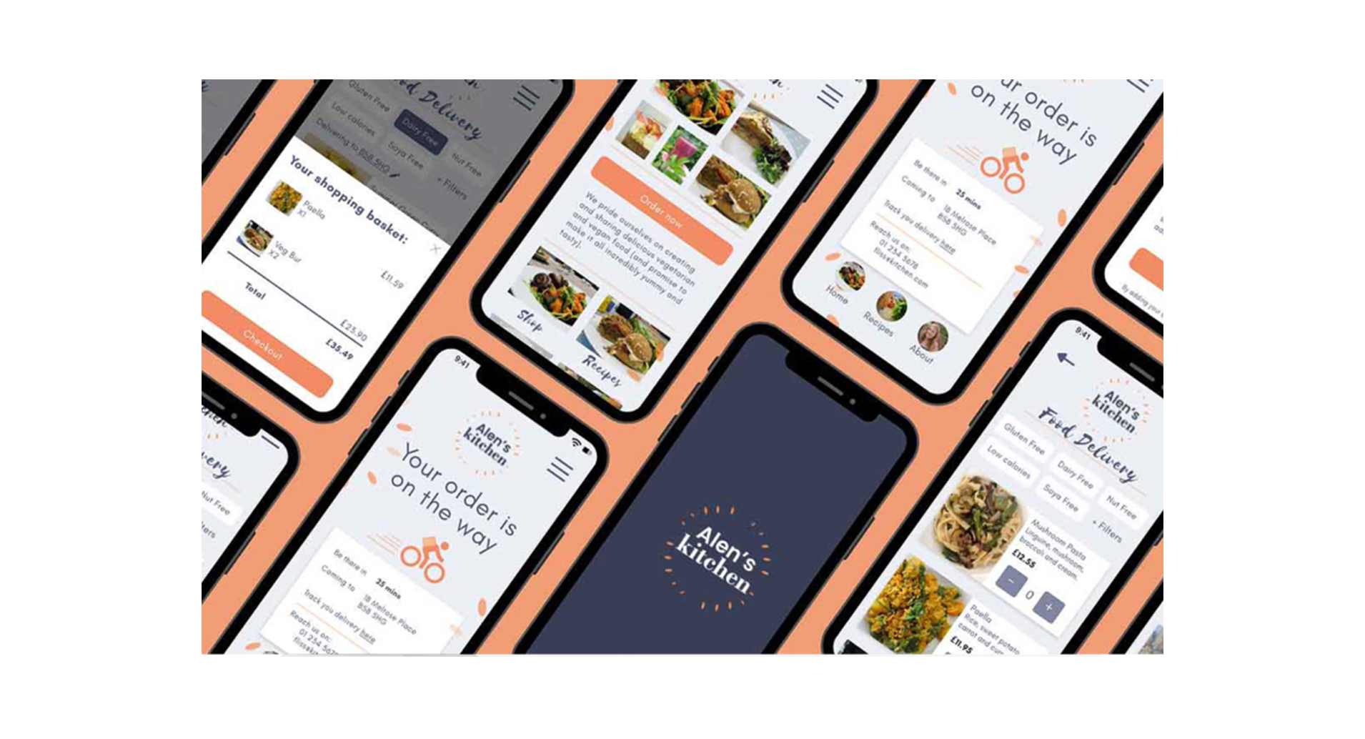
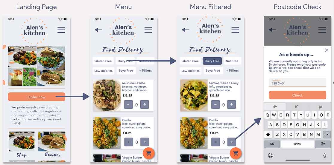
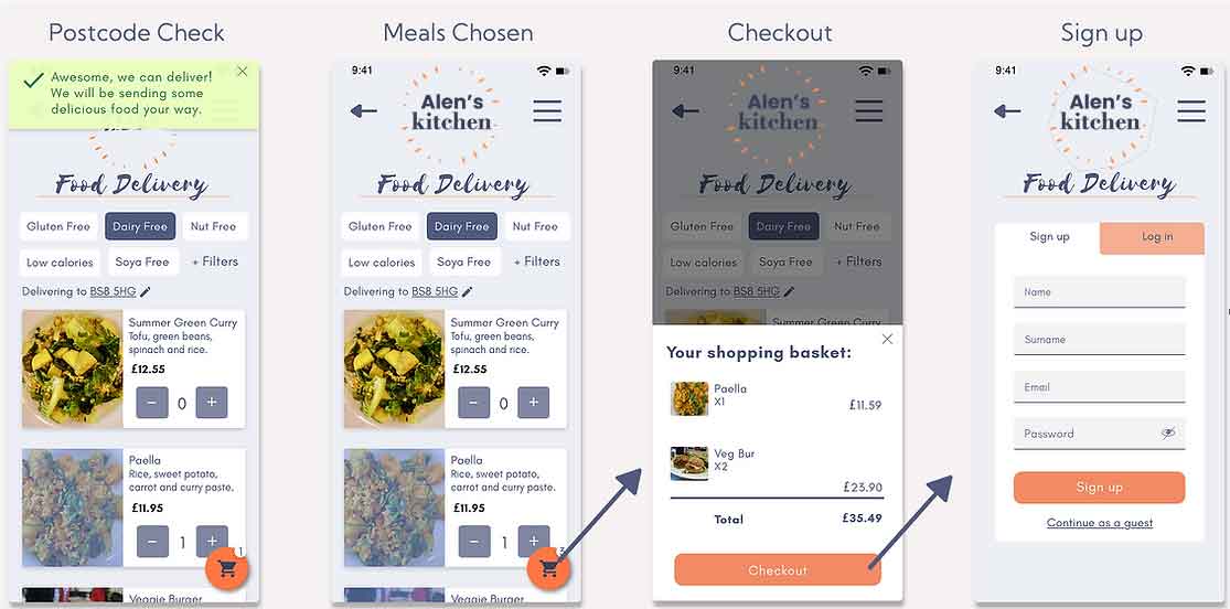
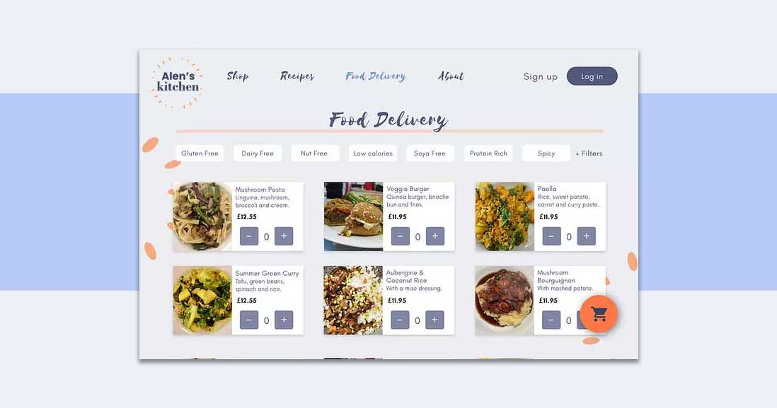
With Covid-19 forcing many restaurants to close, my friend saw an opportunity to act fast and start delivering healthy food options to people’s doors. I was challenged with creating a food delivering feature for Alen’s Kitchen as my first fictional project since beginning my UI|UX course. As part of the process I have designed two separate screen solutions, conducted A/B testing, and combined the best features from each. This has resulted in final screen designs that I am pleased to be sharing with you.
User Centered Design Process
1 - Research
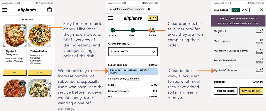
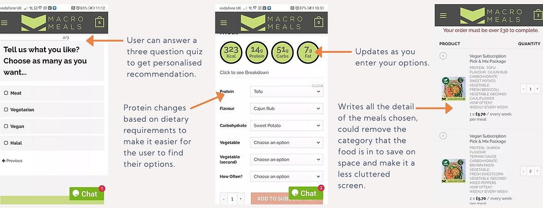
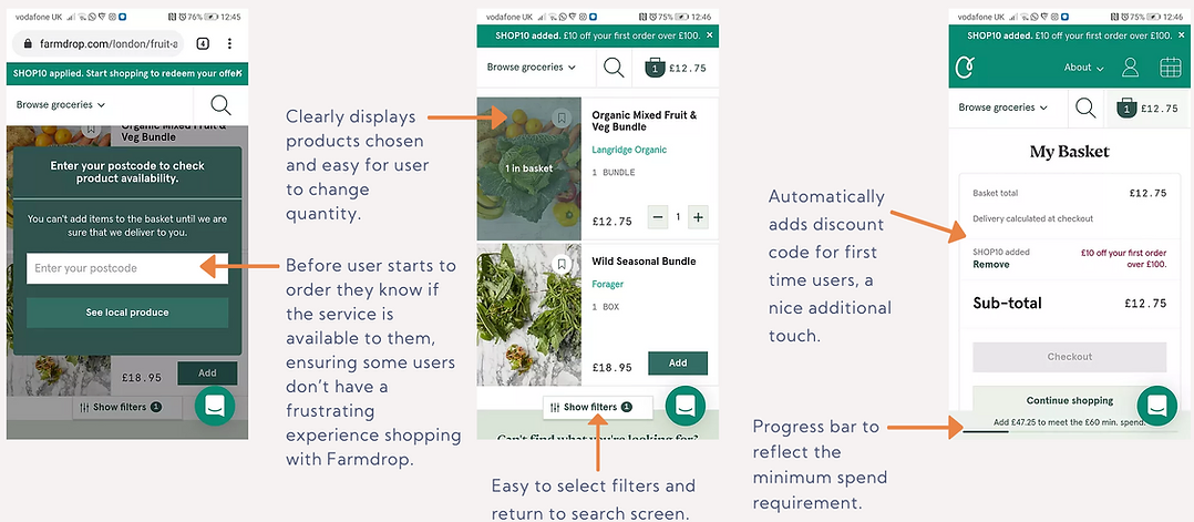
I began tackling the challenge by researching the existing food market. These included Allplants and Macro Meals, both offering meal delivery service. Additionally, I looked further a field for inspiration, including Farmdrop, an online grocery store and Graze, a snack delivery service.
2 - Concept
With inspiration from the research phase, I did two quick sketch solutions to create a meal delivery feature. These formed the foundations for the screen designs. Two separate solutions of screen designs were created to allow for A/B testing.
3 - Prototype & Usability Testing
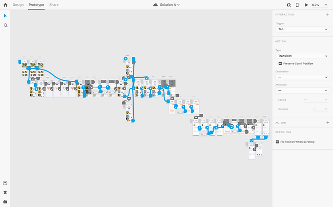
The screen solutions were used to create two clickable prototypes. Both prototypes were tested to enable me to uncover which features and designs worked best. The results then led to the creation of one final product which was presented to Alen.
Research
All Plants
Macro meals
Farmdrop
Concept
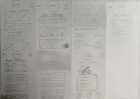
User Flow

Solutions Sketches
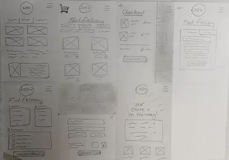
Main differences from solution A:
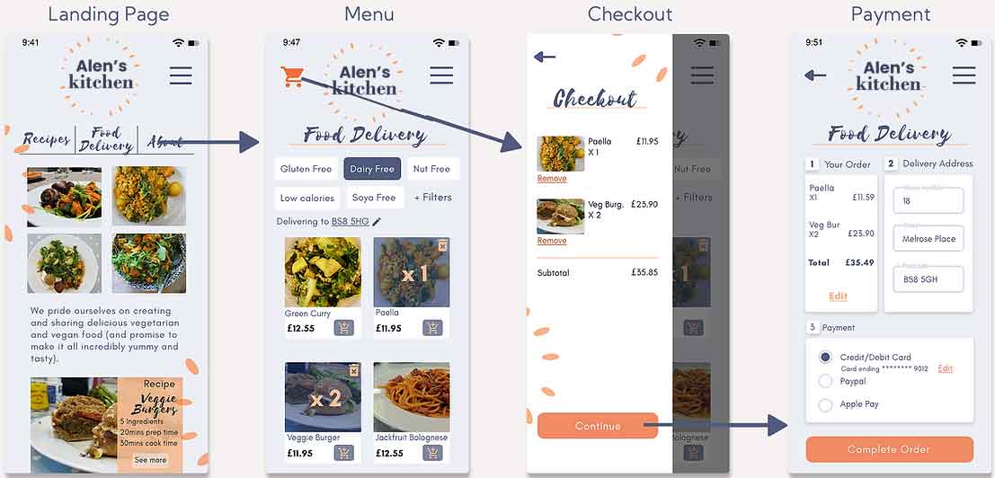
The home page layout has been changed, with the main options presented at the top of the page and no CTA.
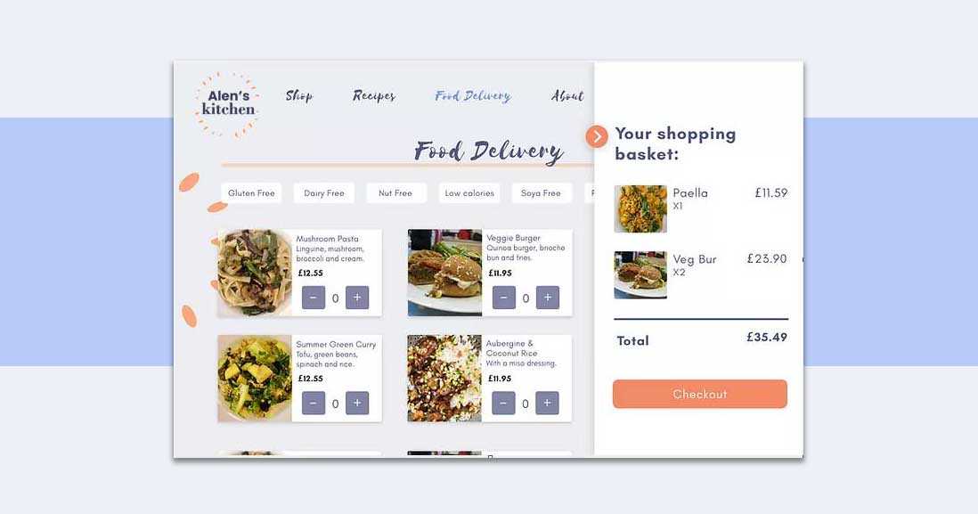
The menu layout has changed and the basket view now slides in from the left instead of from the bottom.
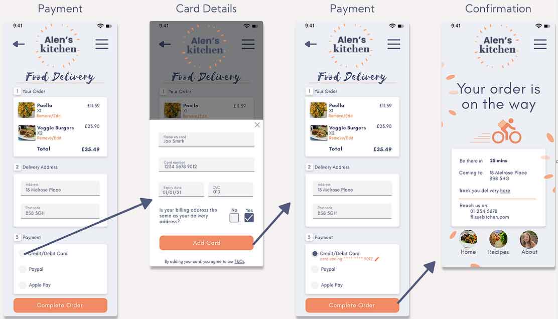
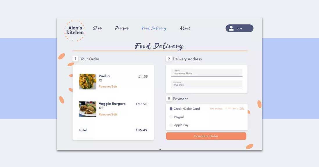
The payment page will be laid out differently with order details and delivery address next to each other and payment details placed below.
User Flow A
User Flow B
Prototype & Usability Testing
The Prototypes
Two clickable prototypes were created using Adobe XD. This allowed for them to be shown and tested from a mobile phone making it a realistic user experience for the participants in the usability test.

Usability Tests
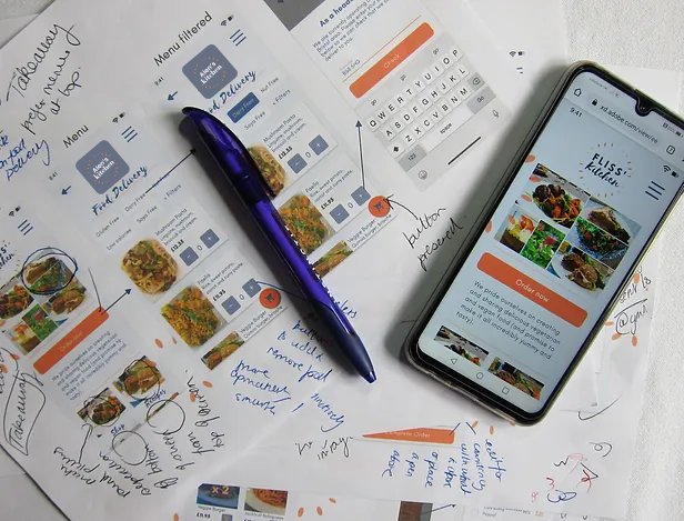
Three participants took part in the usability and A/B preference testing. All sessions were moderated and completed in person. I led the sessions by encouraging participants to share their impressions of the screens as they saw them and focused on observing their reaction. Once they had completed the usability tests, I asked participants which screens they preferred from the two clickable prototypes.
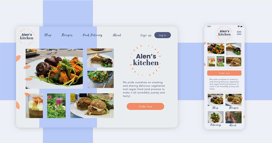
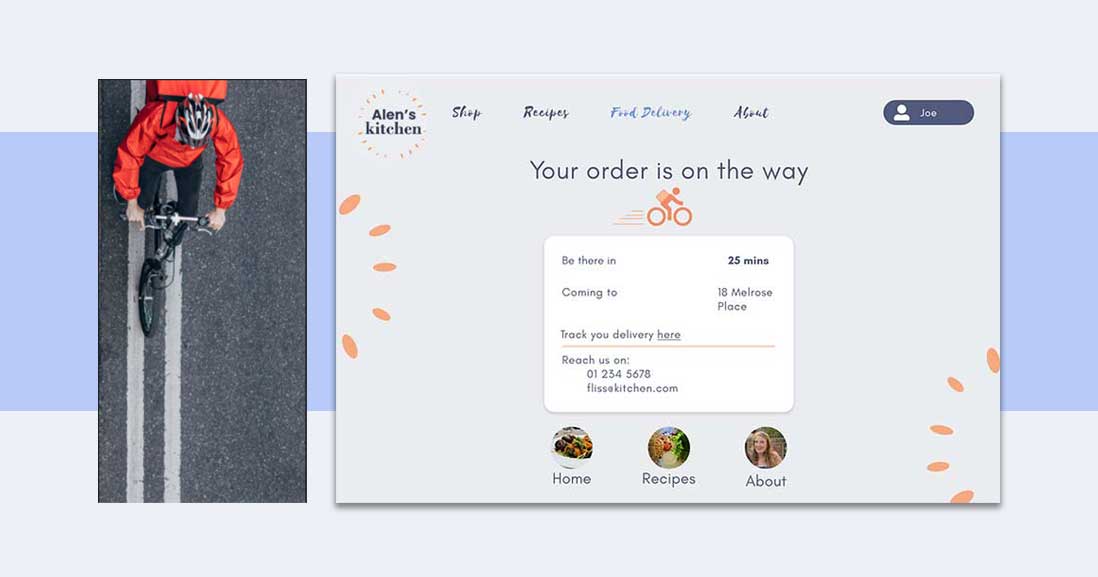
Responsive Design.
1
2
3
4
5
Thank You
You've made it to the end! Thank you for taking the time to review my work.